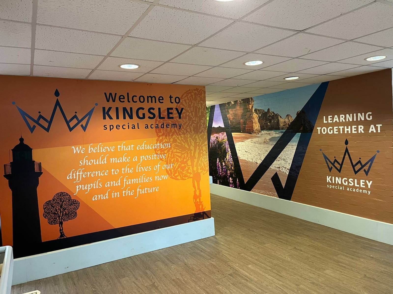
Visual representation of the school’s mission statement can be created using wall graphics to showcase its core values to everyone entering the premises at a glance.
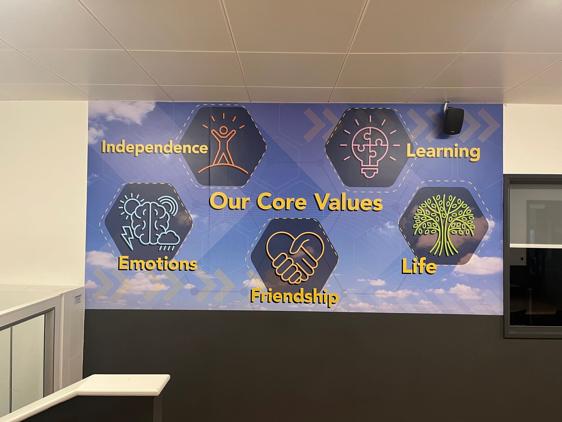
Visual representation of the school’s mission statement can be created using wall graphics to showcase its core values to everyone entering the premises at a glance.
- I use wall graphics to bring the school’s mission statement to life.
- Designing wall graphics displaying the school’s mission statement can communicate its beliefs to everyone entering the premises. Here are some tips on creating and installing wall graphics that effectively express the school’s mission and values;
Important Design Components for Visualising Mission Statements:
Essential Standards:
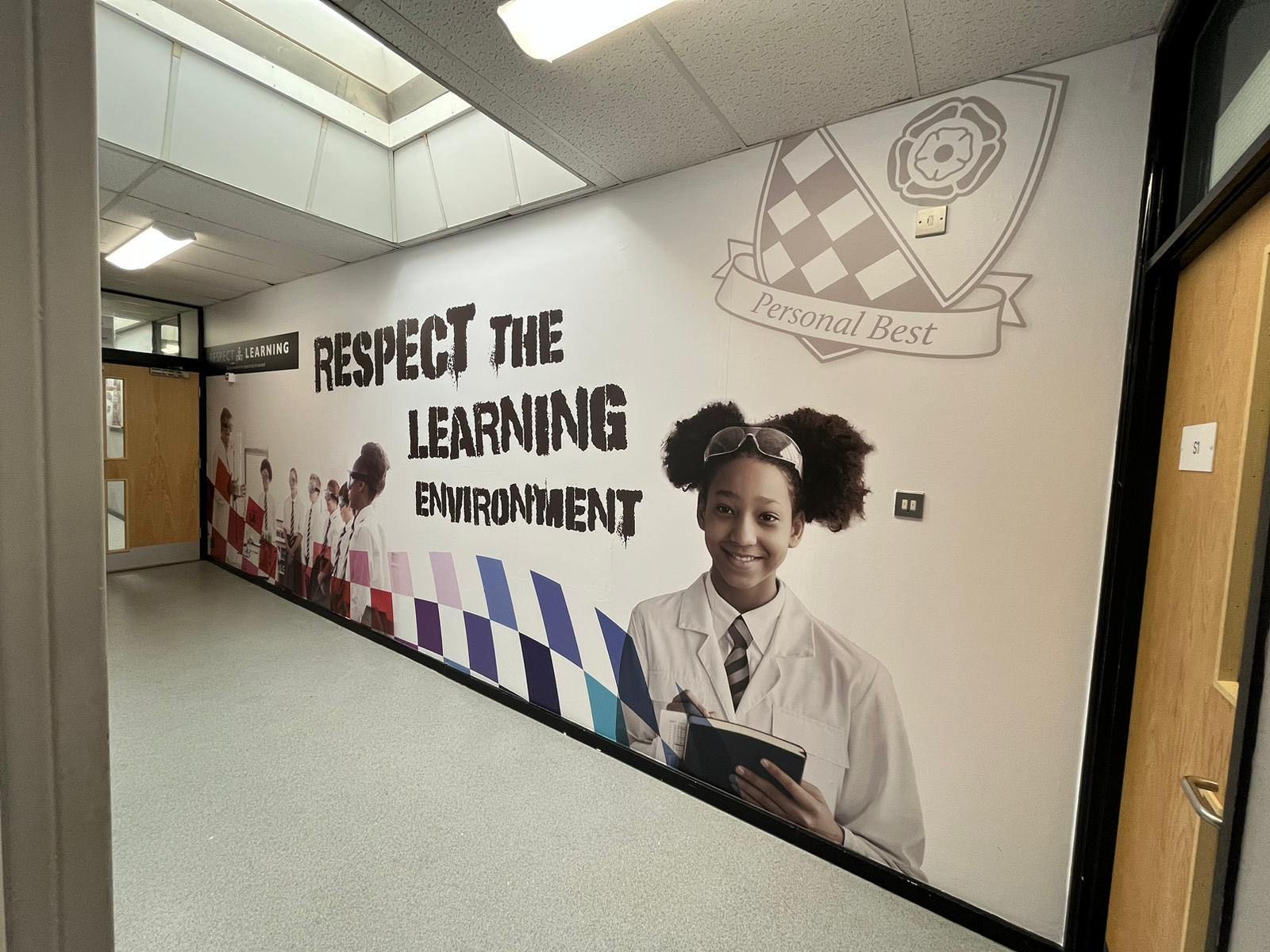
- The mission statement should emphasise "Excellence," "Integrity," "Community," and "Innovation."
Utilise.
- Icons that embody these fundamental principles—like a book for wisdom and learning, a globe for awareness on a global scale, or a handshake to symbolise unity and collaboration within communities.
"Images that inspire."
- Showcase student involvement by incorporating pictures of students actively participating in activities that mirror the school's values, such as working on projects or engaging in sportsmanship and community initiatives.
Emphasising diversity and inclusion
- It involves showcasing a variety of students and staff members to promote an inclusive environment for all.
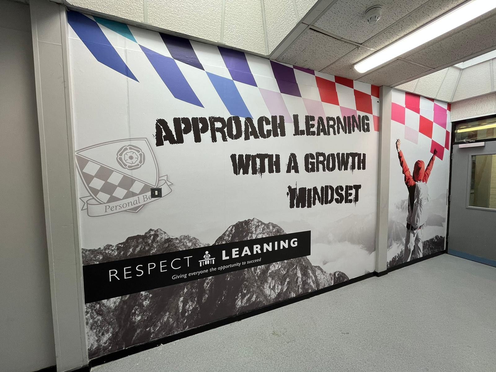
Dynamic and Captivating Design;
- Utilise visuals with bold and lively colours and contemporary design features to enhance the visual appeal of the graphics.
- Ensure that the text is big enough to be read from afar so everyone can easily access the mission statement.
Strategy for Implementation
1. Collaborative Design Process;
- Involve the Community: During the design phase, engage with historians, artists, and community leaders to ensure accuracy and cultural sensitivity.
- Input from Students and Teachers: Gather ideas and feedback from students and teachers to incorporate their viewpoints into the graphics representing the school community values.
2. Selection of Materials;
- Sturdy and Eco-Friendly Choices: Choose environmentally sustainable materials to ensure the graphics' longevity while aligning with sustainability principles.
- Safety Considerations: Ensure all materials used are non-toxic and meet safety regulations.
- 3. Professional Installation;
- Skilled Installation: Enlist the expertise of installers to ensure an accurate application of graphics and prevent issues related to alignment or damage.
- Seamless Integration: Ensure the graphics blend seamlessly with the school's architecture and interior design.
4. Maintenance and Updates;
- Routine Maintenance: Establish a schedule for maintenance to uphold the graphics’ freshness and vibrancy.
- Content Updates: Plan for updates to ensure the content remains current and reflects community achievements and cultural developments.
Examples of Wall Graphics Centered on the Community
1. Welcoming Mural;
- Design: A mural at the entrance featuring illustrations of landmarks, cultural symbols and a welcoming message in languages spoken within the community.
- Impact: Establishes an impression of the school's ties to the local area and its dedication to inclusivity.
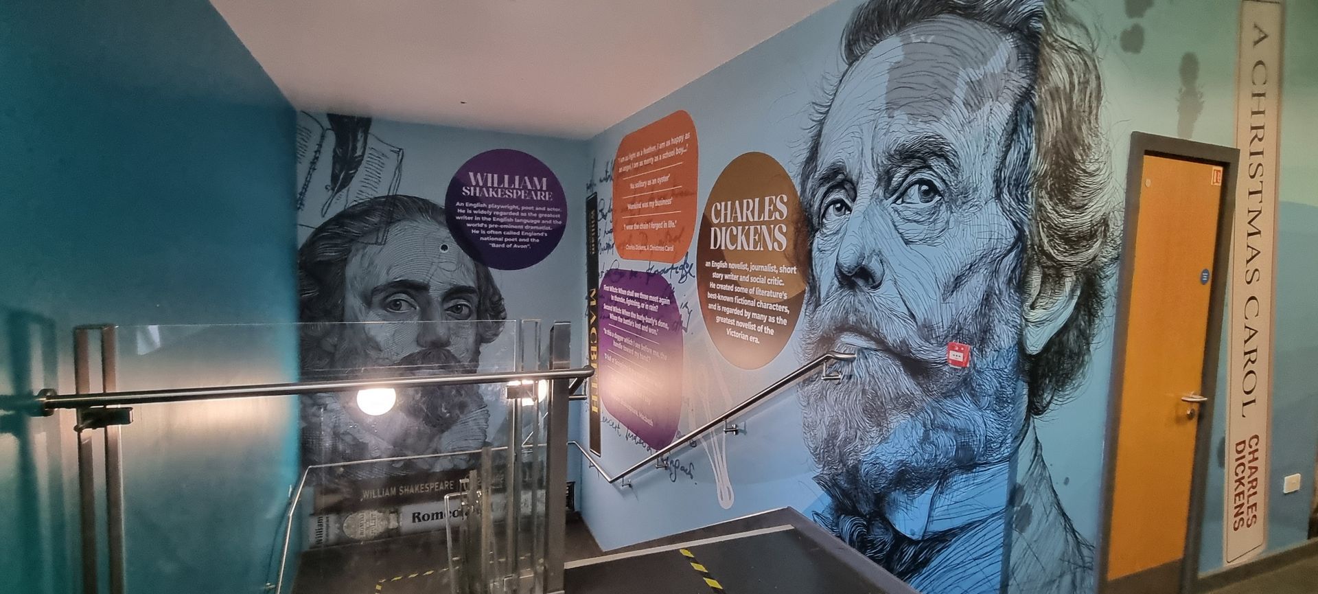
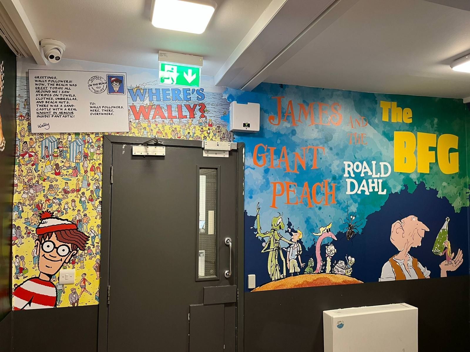
2. Cultural Heritage Corridor;
- Design: Adorn a hallway with murals depicting events, cultural celebrations and traditional attire unique to the local community.
- Impact: Educates students and visitors about the area's legacy, fostering respect and admiration.
3. Community Showcase Wall;
- Design: A display showcasing community initiatives, student contributions, and collaborative projects between the school and community organisations. This event highlights the involvement of the school and the community. Acknowledges the accomplishments of both students and local partners.
Interactive Map;
- Design: An area map featuring interactive elements that offer historical insights, exciting facts and narratives about notable locations.
- Impact: Involves students in discovering their community, enriching their sense of belonging and pride in their locality.
In Conclusion;
By incorporating wall graphics that mirror the community heritage, schools can establish a sense of unity and belonging that resonates with students, faculty, and visitors. These visuals enhance the school's appeal and underscore its essential role in the community, promoting a sense of pride and unity. This strategy showcases the school's dedication to embracing diversity and inclusivity, creating a motivating environment for everyone.